Jastipku

Jastipku is a platform that connects customer to delivery service provider (known as Jastiper) in the neighbourhood. From this app, customer will be able to submit a request containing list of item(s) to be bought. Later, customer will be able to see price that were offered by the Jastiper(s), and should both parties agrees, the transaction will be concluded.

This project is meant to be a college project and is currently still going on for further validation process.
About
Jastipku
Problem
The reason why this application started was that we discovered ever since pandemic happens, there has been spike of demand with delivery service business as travel and logistics are limited. However, in our region (Riau Isle) there are hardly any proper platform to support this line of business. Hence, we come up with this application, which meant to solve following problem:
Security
  • It is not uncommon for customer to experience fraud when doing transaction with anonymous account online
Accessibility
  • There were hardly any platform that accommodate delivery service business, making Jastiper hard to reach their customer
Efficiency
  •  In certain apps, payment can only be done from the bank
  • Buyer wasted a lot of time negotiating price from one Jastiper to another
Interview
Upon receiving the projects, first thing I did is conduct an interview with the target user of this application, in this case: my manager.

The objective of this interview is to gain more understanding about them as a user, in order to make my design more tailored to their needs. During this session, I ask questions like:
  • What is the purpose of having this function(s)?
  • Under which occasion will you use this function(s)?
  • How often do you exercise this function(s)?
  • How are your day-to-day work like?
How Might We
Competitor Analysis
The main goals for conducting the research is to inquire more insight regarding the business model and pricing standards within the industry. For the analysis, we couldn’t find any relevant apps within our region, so we chose from other area instead.
User Flow
Afterthat, I visualize the flow of user (customers and Jastipers) when theyrequest/accept a delivery offer by using a flowchart.
Wireframe
Afterlisting all of the processes, I created the wireframe, which was thenpeer-reviewed by my team. Minor revisions were then noted and translated into ahigh-fidelity design.
Design System
To kick off the high-fidelity design, I started by building a small design system, which gradually expands as the design grows. Prior to making the design, I do look for some reference picture online as source of inspiration for determining the design concept.
Prototype
Making the design takes a few iterations as feedbacks were collected and revisions were made. Amidst the process, we‘ve completed unmoderated remote usability testing on 3 users (2 buyers and 1 jastipers) via Google Meet. Following is the latest update of the prototype for Jastipku.
Jastipku Banner
Conclusion
From user perspective, I have yet to ascertain whether this application could solve their problems, nor I know if this application is a viable business. What has been done up to now is that I try to convey this potential solution of ours in the most efficient and user-friendly interface possible.

Regretably, we’ve only conducted testing on few users, which is far from sufficient. I think more test should be conducted in order to construct a more valid strength-weakness analysis over this application. That being said, following is the few points regarding the pros and cons of this application constructed based on the results of existing testing process:
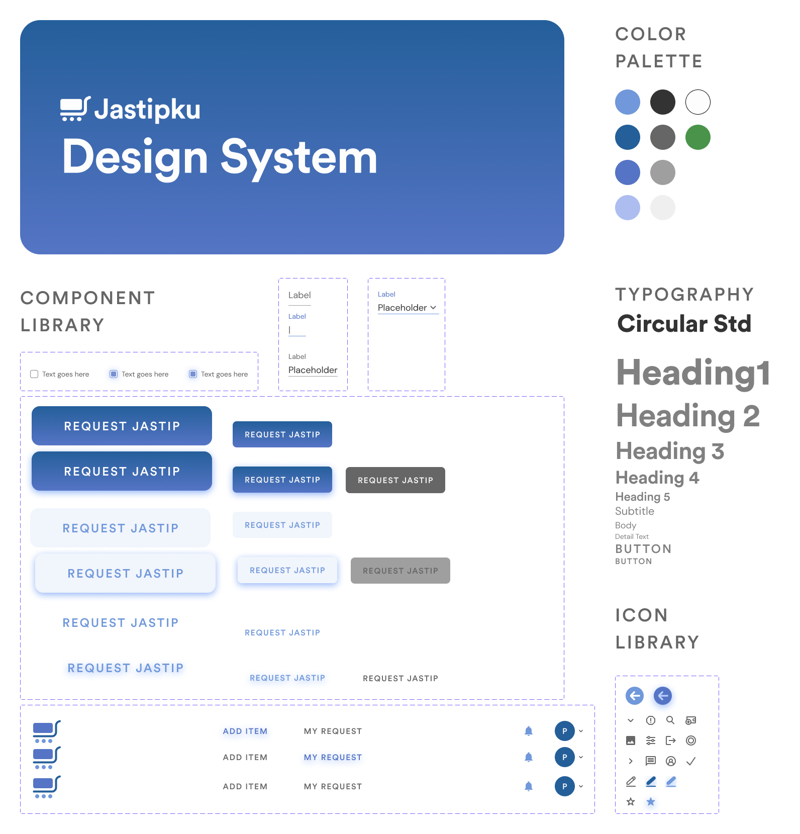
Done Well
  • Interface’s simplicity and aesthetic
    All testers commended how they like the interface for being simple and elegant.
  • Simple user process
    According to testers, the process of placing of request is very intuitive.
To be improved
  • Clarity when conveying information
    During testing, testers (user and colleagues) are shown to have misinterpret the “price” on Jastiper’s price bidding page. This implies that the informations aren’t represented well enough with the interface.
  • Information encapsulation
    Pertaining to the previous issue, some testers reported that there were some redundant information being displayed on the pages. On the next iteration, information regarded redundant should be removed to promote simplicity.
Currently, this project is still on process and will not be released on public. Therefore, should you have any criticism or suggestion, feel free to contact me here.

Lesson Learned

Documentation is a strenuous task, but might be rewarding
Walking through the procedures step by step with documentation might be intimidating at first as not many of us work on those, especially when deadling with fast-paced self project. However, it occurs to me that writing these help me to evaluate what I’ve learnt and mistakes I’ve made, therefore aiding my and others’ growth.
Conveying information with design may get tricky
Communicating an information through design isn’t as simple as grouping similar element together or setting up a boundary box. Instead, we should also pay attention to the context of the page as a whole. Questions as the following might help: is the component appropriate to be included in the pages? Are we bombarding the user with too much information? Are there chances for user to misunderstand the information given such design?
Getting feedbacks outside the team is priority
Due to time reason, most testing process were done internallly. It was due to this that we found out later on during testing with external users, there were a lot of blindspots we didn’t manage to cover back then. Hence, it is always a must to conduct testing with external users.