Kotakode Design System

Kotakode Design System is a design system developed to ensure the coherence and consistency throughout the products of Kotakode. Kotakode Design System can be regarded as a centralized documentation containing usage guidelines and libraries of all components.

This is one of the project I undertake as an intern in Kotakode, along with another fellow designer.
Why Design System is needed
Kotakode is an online community platform where tech enthusiast in Indonesia can learn and share relevant knowledge from fellow developers. Within a year, Kotakode has grown so rapidly in size, having up to 3 different products now. However, it is during these time that one problem has slowly become more apparent: inconsistency.

In some pages, buttons would have different shapes. In some other pages, various font-size and families are also applied in an incoherent manner. These phenomenon would not only impact the website on visceral level, but would also affect the readability of the codes which ultimately leads to scalability problem.

Realizing these potential problems, it was then decided that a design system should be built before future expansions. Following is the advantages of having a design system:
  • Shorter product development time
    since designers and developers won’t have to rebuild everything from scratch, allowing them ideate, design, and iterate faster
  • Improved collaborating experiences,
    be it between designers and developers or designers across the team
  • Developers may reuse code for the components
    due to a universal standard across all products
  • Consistencies within the UI design,
    as all components comply to the same standard
  • Consistencies within the UI design,
    as all components comply to the same standard
Audit
To kick off the process, we first conducted an audit of all components that our companies use currently, such as: cards, modals, buttons, etc.
Hero Section
  • Button
  • Card
  • Navigation bar
Product Page
  • Sidebar
  • Button
  • Card
Product Details Page
  • Text area
  • Tabs
Sign In Page
  • Input
Research
Upon completing the list, we proceeded to look for design system references from existing companies, such as: Google’s Material Design, IBM’ s Carbon Design System, Shopify’s Polaris, Uber’s Design Systems, and few other design systems that were listed within the article: Top 12 Design Systems to Steal from and Up Your Design Game | by Eva V. | UX Planet. Taking inspirations from them, we split the design systems into a few categories, each containing the usage guideline and their styling properties.
Top 12 Design Systems to Steal from and Up Your Design Game
Result
Kotakode Design System

Lesson Learned

How to collaborate better with Developers
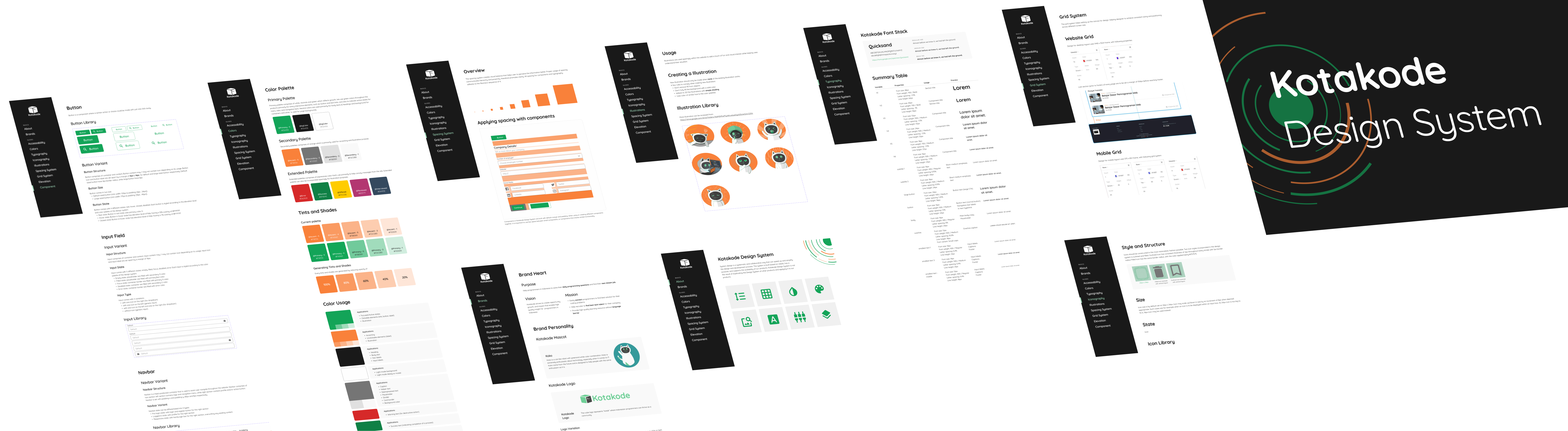
After going through the process of building design systems, I came to discover and understand better about the importance of design documentation such as: variants, usage purpose, styling guide, etc. While it might be daunting to write a lengthy documentation for each design project, but it surely does pay off for the latter collaboration, especially when the amount of detail is just-right
The “right way” to implement component
For inexperienced designer, one might sometimes unknowingly abuse a component for different purpose. Having read usage guidelines from renowned design system give me a better understanding over those component, refraining me from making those mistake.